
From Tile Grid to Feed: Redesigning a School Communication App
1. Overview
Redesigning a school communication app used by 400 schools.
The existing Digistorm app hadn't been updated in nearly a decade. Navigation felt dated, competitors were gaining ground, and the product team had little direct insight into how parents (the primary users) were actually using it. As the sole designer, I led the end-to-end redesign: from scoping what to research and who to talk to, through to a new information architecture, visual language, and a core feature set that is now in trial with schools.
2. Context & Brief
The Digistorm App is a school communication app that keeps parents connected to school life - covering news and notices, the school calendar, event updates, absence logging, and their child's academic information including timetable, assignments, and results.
The previous version of the app had been largely unchanged for almost a decade. While it still had a loyal base of around 400 schools, the product had stalled. The UI felt outdated, navigation had grown unwieldy, and competitors were starting to attract schools away. The brief was to redesign the app from the ground up - modernising the experience while preserving what schools and parents depended on.
I was the sole designer on the project, working without a dedicated PM and with limited existing user research to draw from.
3. Discovery & Research
The intermediary problem
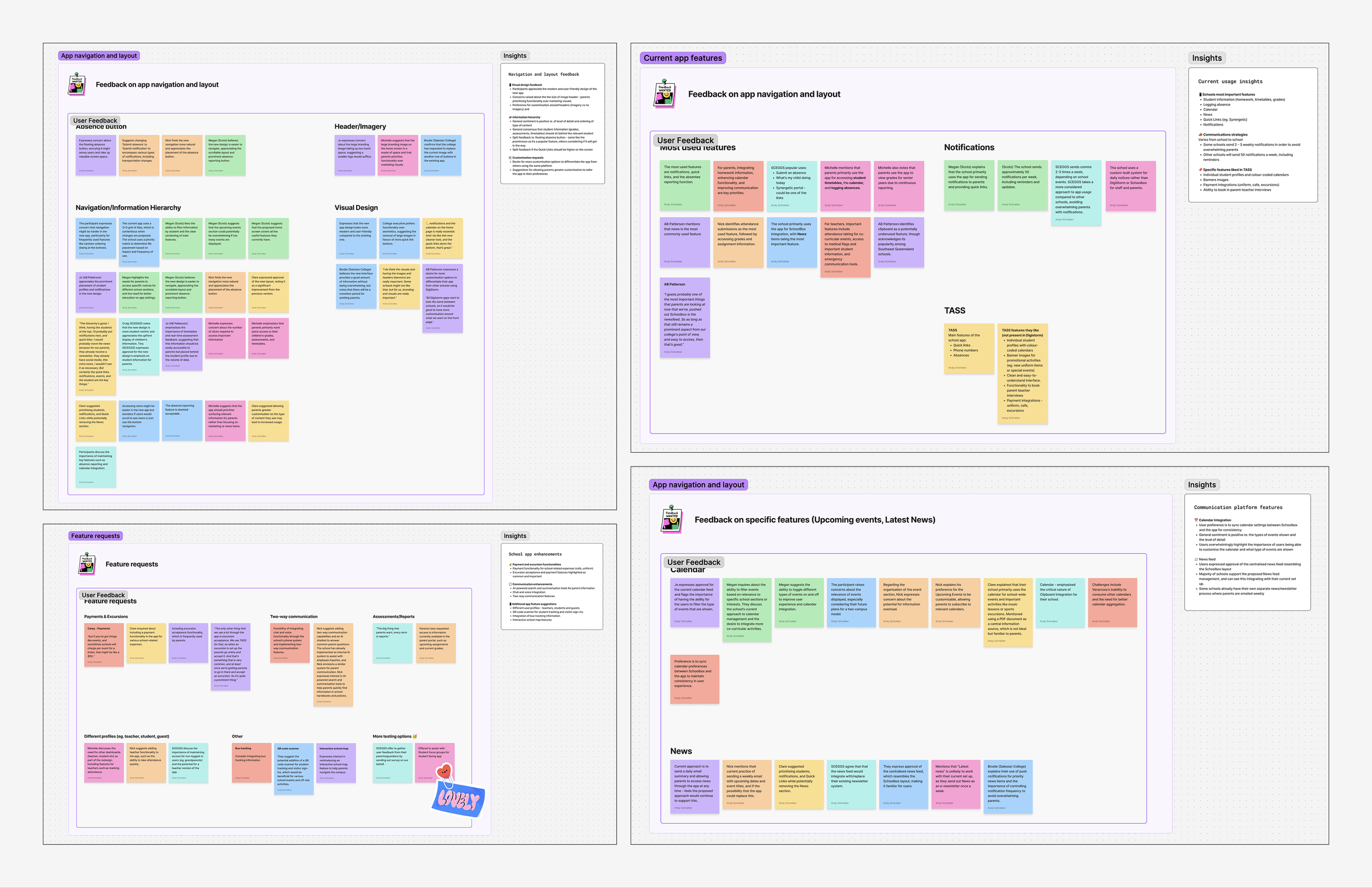
The most significant research constraint was that I couldn't speak directly to parents - the app's primary users. Instead, I conducted interviews with approximately 20 schools across a range of staff roles: IT coordinators, principals, and administrative staff. These people configure the app, manage communications to parents, and field feedback when things don't work. They're a useful proxy, but a proxy nonetheless - one of the defining constraints of the project.
What schools told us
Interviews surfaced a clear hierarchy of what parents rely on most: the school calendar, news, notices and newsletters, and push notifications ranked highest, followed by student-specific information such as homework, timetables, and grades.
Competitor analysis
I also reviewed several main competitors. Whilst their apps offered some functionality that we didn't support, such as payment processing and certain third-party integrations, their UI was visually dated and difficult to navigate. Closing the feature gap was a longer-term roadmap problem, whereas the user experience gap was something I could act on immediately.
4. Problem Framing
Research pointed to a clear structural issue underneath the surface-level visual staleness - the app was organised around the school's data structure, not around how parents actually needed to use it.
A grid of 9-12 tiles made sense as a feature inventory, every module had its own entry point. But for a parent checking in on their child, it meant tapping in and out of separate modules just to get a basic picture of their day. Information that belonged together was siloed and nothing was surfaced at the time when it mattered most.
The consolidation challenge was twofold: simplify the school-level communication experience (News, Events, Calendar) while also creating a child-centric view, something that didn't exist in the previous app at all. The design principle I worked to was to organise around the parent's context, not the product's feature set.
5. Design Decisions
From tile grid to feed
The most significant structural decision was replacing the tile home screen with a feed-based layout. Rather than presenting every module as an equal entry point, the new home surface shows widgets - each giving a snapshot of the most relevant information with the option to go deeper. The goal was to let a parent land on the app and immediately see what's happening, without having to know which module to tap into first.
The student profile view
One of the more meaningful structural additions was a dedicated view per child. Previously, getting a complete picture of a student meant navigating in and out of Classes, Due Work, Events, and Timetable separately. The new design lets a parent tap on their child and get a full overview in one place: timetable, due work and assignments, grades, and reports all surfaced together. For parents with multiple children at the same school, this was a particularly significant change.
Consolidating fragmented modules
Several areas of the old app had grown into separate modules that logically belonged together:
News, Notices, Newsletters and Sports: Four separate modules, each with its own notification system running independently of the main Notifications centre, were consolidated into a single News module. All notifications are now funnelled through one central Notifications inbox, and a filter was introduced so parents can sort content by type without needing to navigate between separate areas.
Timetable & Events: Timetable and Events were two separate modules, requiring parents to tap in and out of each to piece together a picture of their child's schedule. Student selection was cumbersome - exiting one module to switch children before entering another. These were brought together into a unified Calendar module where users can switch between students and toggle event visibility without ever leaving the view.
These decisions followed the same logic to reduce the navigation burden by collapsing things that parents naturally think of as one thing.
6. Feedback & Refinement
Early concepts were shared with schools throughout the process, both to validate navigation assumptions and to observe how staff (as proxies for parent behaviour) responded to the new structure. One of the more valuable sessions involved presenting a version of the redesigned home screen, which generated specific and actionable feedback.
What changed
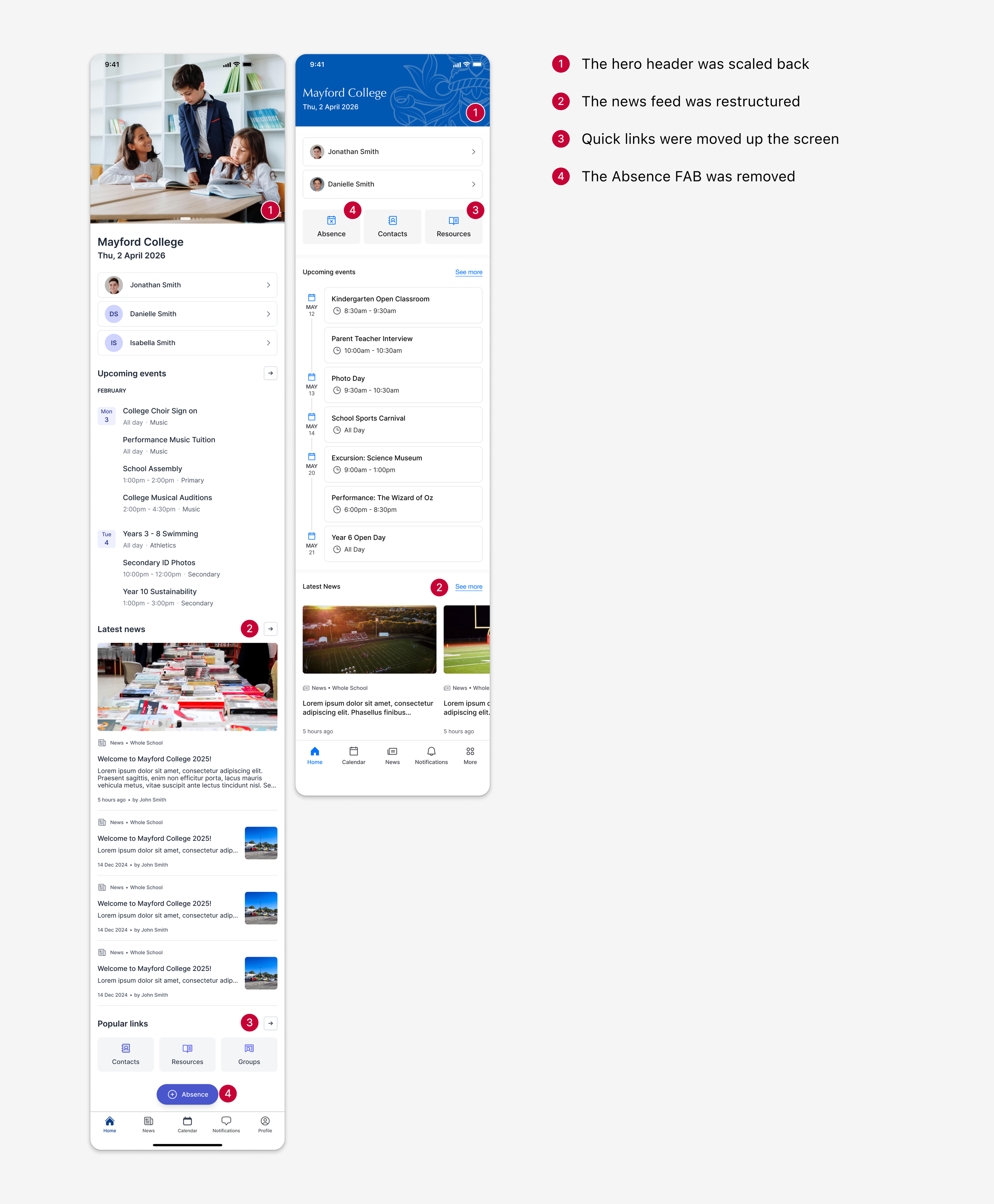
The hero header was scaled back. The original design featured a prominent branded header with school imagery. Schools appreciated the branding flexibility but raised two practical concerns: the size felt overwhelming, and imagery would likely go stale. There was also a sense that parents would rather get straight to what they needed. The header was reduced to give school identity presence without dominating the screen.
The news feed was restructured. Schools liked the consolidation of News, Newsletters, and Notices into a single feed, but flagged that the combined volume added significant scroll depth to an already long screen. The feed was moved to a carousel widget, helping to keep the home screen more manageable.
Quick links were moved up the screen. Schools valued the ability to set custom quick links but felt their original placement at the bottom of the screen made them easy to miss. They were repositioned higher where they'd be immediately accessible.
The Absence FAB was removed. A floating action button for logging absences was intended to surface a high-frequency task. In practice, schools felt it was visually intrusive and obstructed content. It was folded into the quick links section instead - still prominent, but no longer competing with everything else on screen.
Beyond these revisions, the core information architecture held up well. The consolidation decisions, such as unified news, centralised notifications, the combined calendar, and the student profile view consistently resonated with schools, and the feed-based home required less explanation than the old tile grid.
7. Feature Highlights
The Schedule widget
The Schedule widget is one of the most technically considered pieces of the app. On the surface it's a simple overview of a user's day or week, but underneath it's pulling from multiple modules simultaneously and adapting its content, structure, and time horizon based on who's looking at it.
For parents: the widget is week-focused, surfacing school-wide events relevant to them: assemblies, parent interviews, performances.
For students: it's day-focused, combining their timetabled classes with co-curricular commitments like sports matches, drama rehearsals, and other curriculum events.
For staff: it shows their teaching schedule for the day alongside quick access to take attendance, plus any other commitments such as staff meetings, assemblies etc. in a single view.
The design challenge was building one component that felt purpose-built for three different users, without fragmenting into three separate things to maintain.
Learning Moments
Learning Moments is a new integration not supported in the original app, pulling in milestone updates that staff upload via the Learning Moments platform - photos, videos, audio recordings, and written descriptions of things a child has achieved or experienced in the classroom.
The design decision was to present these in a social feed format, so it felt familiar to parents who’ve used platforms like Instagram and Facebook. Each post surfaces the attached media, the post’s description, and allows parents to comment and interact. The familiarity of the format was deliberate, as it lowers the learning curve for a feature that parents have no prior reference point for in a school context. It also signals a shift in what the app can be - not just a notice board, but a window into a child's experience at school.
8. Outcomes & Reflection
Where it stands
The app is currently in trial with schools, and early feedback has been consistently positive. Schools have noted that the UI feels modern and fresh, and that content is significantly easier and faster to find.
What I'd do differently
The most significant gap in this project was not having the opportunity to speak directly to parents or students. Schools were thoughtful proxies, but they interpret the app through an administrative and communications lens, not through the lens of a parent checking in on their child between meetings, or a student looking up what's on after school. Direct user research would have sharpened the student profile view in particular, where I was making assumptions about information hierarchy without real validation.
I'd also have pushed for a structured beta with actual parent and student users - a small cohort of trial schools where users could submit in-app feedback directly, giving me a feedback loop that didn't rely entirely on school staff as intermediaries.
What's next
The current release focuses on the parent experience, and upcoming versions will extend the app to support both the student and staff experience.